Frase - O - Matico

USER TESTING

70%

UI/UX

90%

VISUAL/DESIGN

90%

ILLUSTRATION

90%

FLASH / HTML

60%

The overall goal/strategy was to develop a series of games that increase visit counts on the Hershey’s’ gamified fan-based landing page. Besides making the concepts UI/UX fun, colorful on brand and easy for all ages to play. The team needed to be mindful of the device limitations per Latam use cases and any US based backend limitations per hosting services.

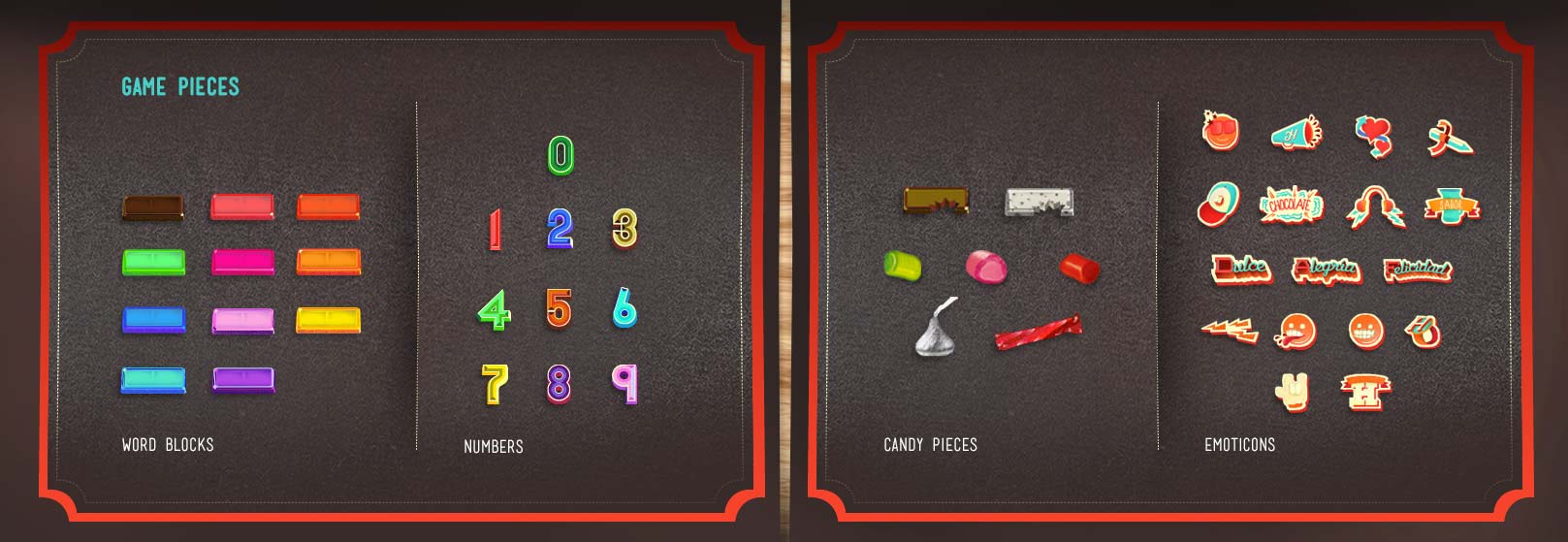
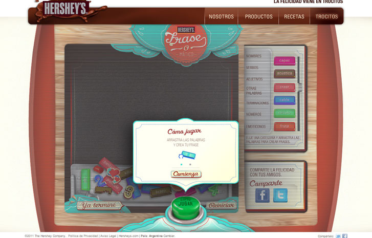
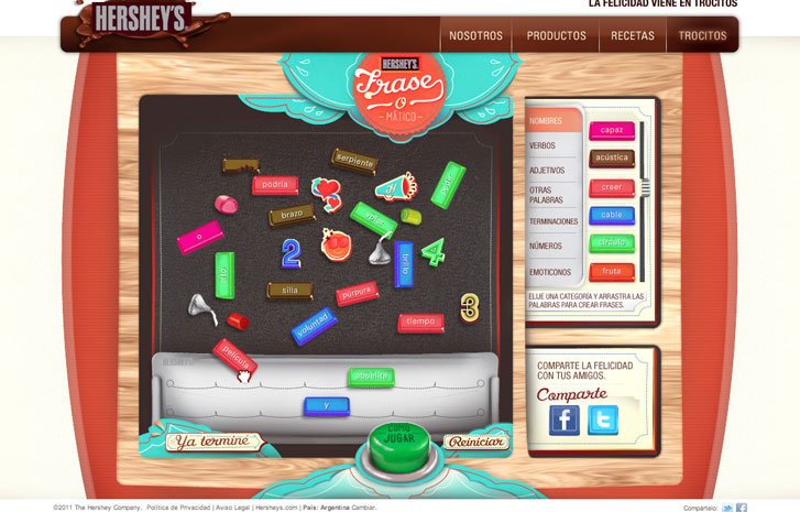
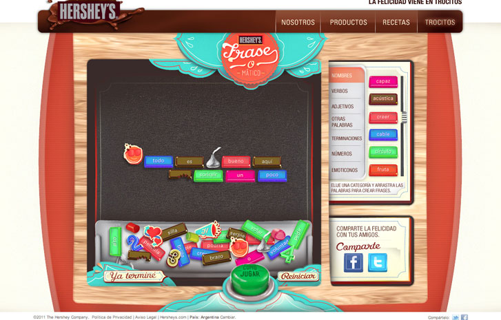
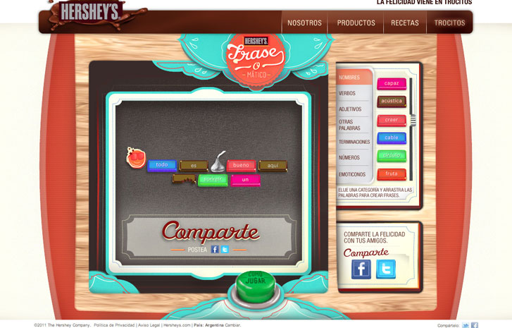
There were two different games that needed to be developed and executed. The first game was based on the old school magnetic poetry concept using over 500 words and emoticons within the Hershey’s brand.

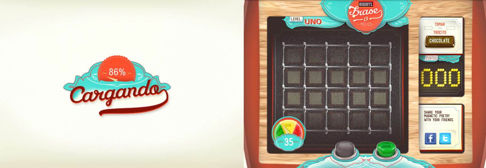
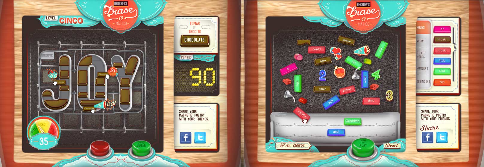
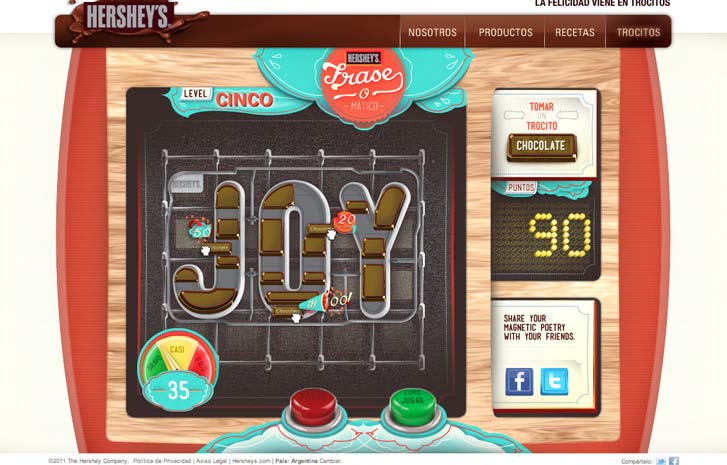
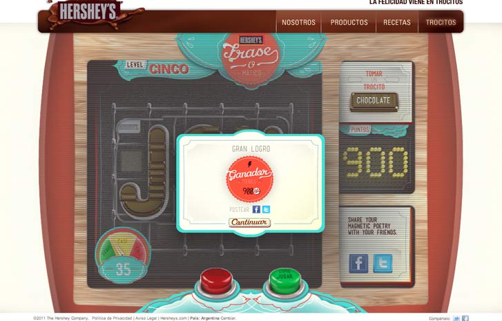
The other game is more of a competitive race against the clock to unlock the chocolate puzzle pieces being rewarded with points towards an online Hershey’s Contest.

Please follow our process below on to how we were able to deliver the execution.

Understanding our core users

Our first challenge was to help our client identify who their hierarchy of users would be. Also, this would also require some out of the box thinking, that we would need to leverage our data and user testing and also some good old-fashioned guerilla testing. This was also a great opportunity to leverage gamification into the Hershey’s brand to express the overall brands focus to its users.

Desktop

App

Gamers

Hershey fans

The art of gamification

Overall, we needed to present a valued business case for the overall concept. Presenting how and why gamification “Hershey’s Octalysis diagram below”, would motivate a user’s behavior towards the brand, injecting leaderboards, adding a reason for return visits. Adopting cross channel advertising for awareness. Developing clear and simple game mechanics also apply research within successful use cases all towards the building blocks for a Return on Investment.

Documenting Design Discovery

In doing a design discovery, you and your team produce a shared pool of knowledge to drive your work. That knowledge informs design decisions, defines what “success” means, and forms the basis for your critiques. In building a shared pool of knowledge, you’re creating a common language to talk about the design of the project.

Discovery’s Six Assertions

So, what is defined within this language? There are six things that discovery produces:

A Problem: What we are trying to fix

An Objective: What your solution is trying to achieve

Context: What adds constraints to the design process

A Big Idea: The central concept that ties everything together

Rules: Principles and guidelines that steer your process

Models: Representations of the experience for inspiration, consideration, and testing

Assertions give artifacts purpose

Collectively, these things are called assertions–things that you can say as a consequence of doing discovery. Assertions aren’t deliverables or artifacts but an intention or purpose, what we say through a deliverable or artifact. Think of it as a wireframe which represents the structure of a page or screen, but why are you making it?

Developing a user flow

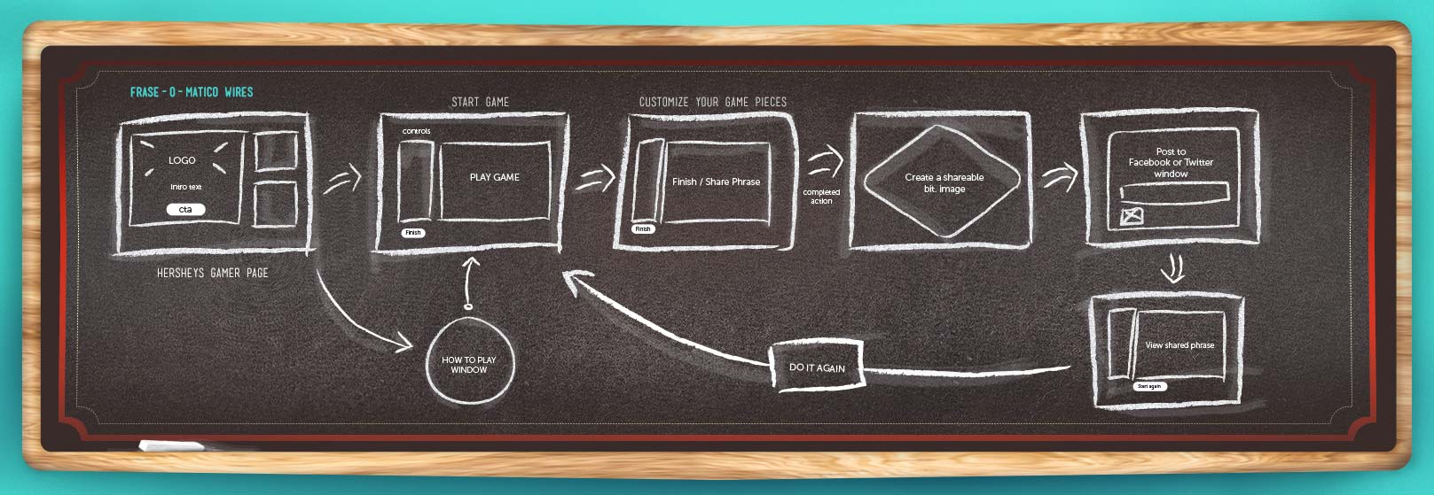
Together we established documentation to completely define the users path from a sign up to returning perspective, we also looked at how to share out scores and leaderboards, which played into the experience for each user. This is a cleaned-up version that was shared with client.

DESIGNING FOR THE EXPERIENCE

Experimentation and humble approach

As the road map for the project approached the design phase, we again used the narratives we collected. We combined the research that we user tested to further generate the meaning behind each element, accessible and emotional impact that each part of the experience generated which in return contributed to a actionable product.

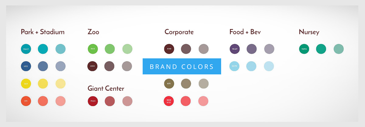
We really drove into the meaning behind the brands guiding principles during the design and development process to stay true to the rich Hershey legacy, Making this a driver for developing our color theory – which we than created assets that also reflected on that human emotion

DELIVERING ON THE DESIGN

With the core user groups and branded principles aligned we than started to develop the overall look that this experience would carry through all the way to the share integration.

CREATIVE CLOSE-UPS

RICH MEDIA SAMPLES

Phase 1

Phase 2

Phase 3

GAME SAMPLES DETAILED

One last thing:

If you can’t enumerate all your assumptions, you can surely approach discovery with some humility. We learned a few things, perhaps had a few flashes of insight. But we’re doing it in the service of the product, probably for a specific project. You’re not now the Keeper of All Knowledge.

Leave a Reply