
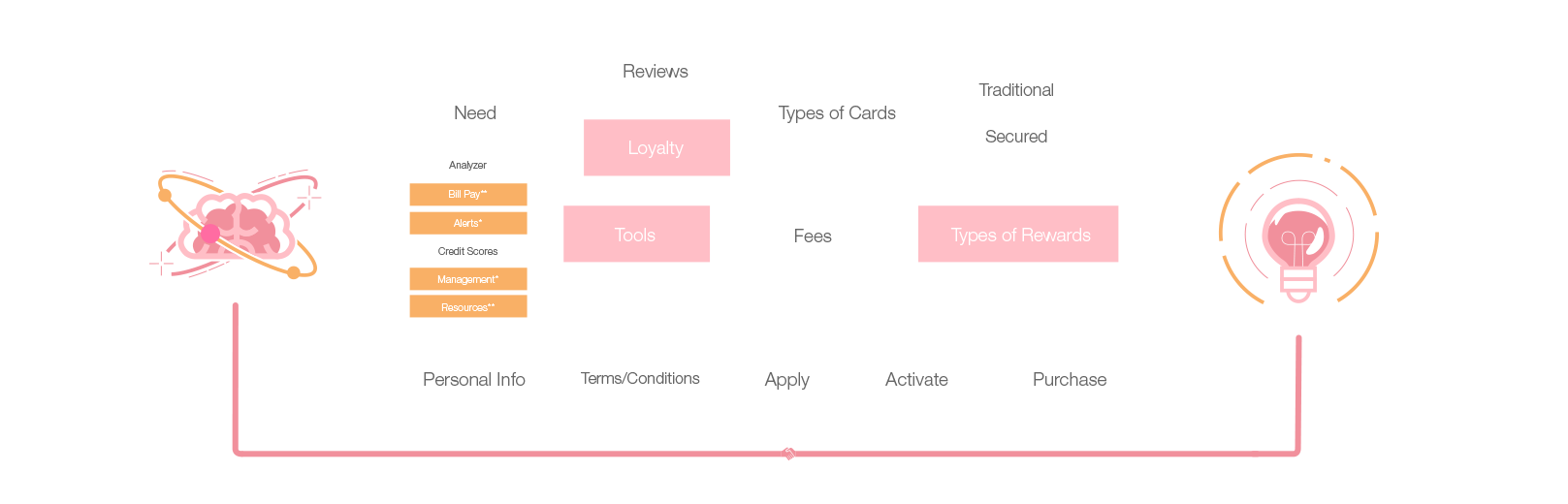
The Credit solutions page refresh started with a complete overhaul on the basic knowledge and application of user-centered design & methodologies. With our complete list of strategic analytical insights, we were able to formulate a true page architecture on multiple mediums that all users could easily navigate upon a visit.
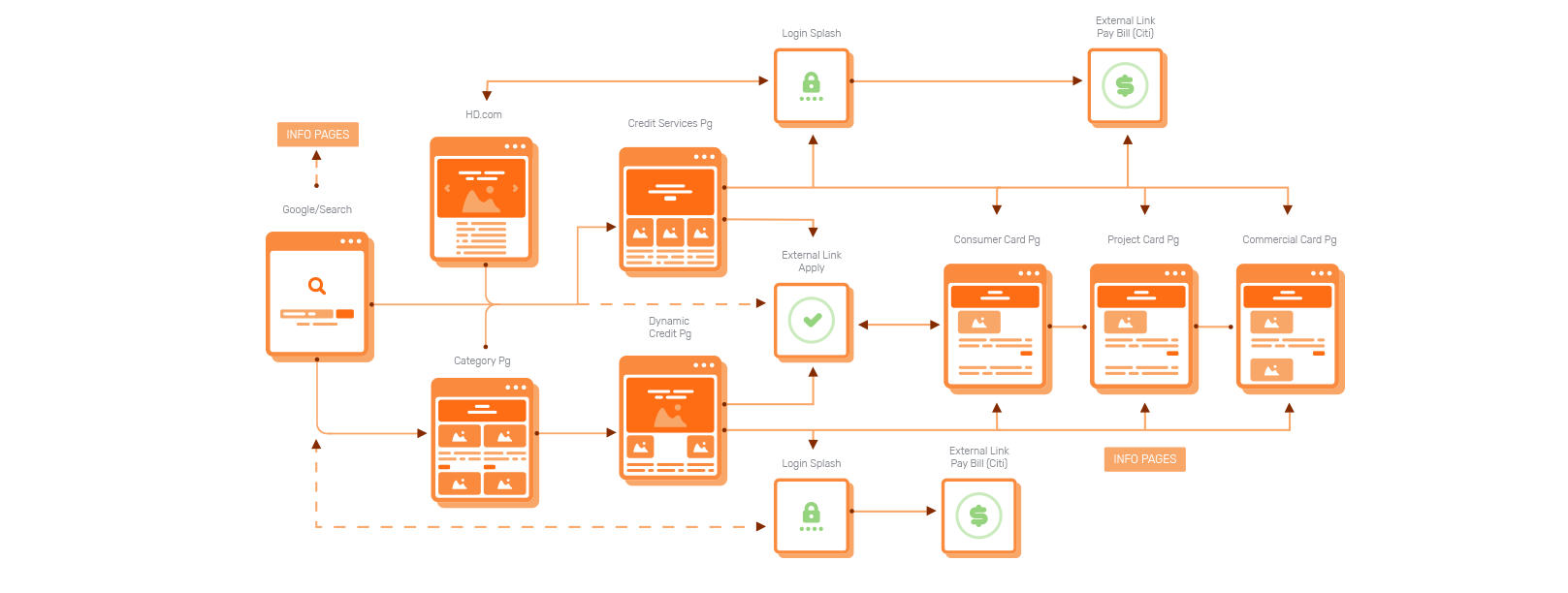
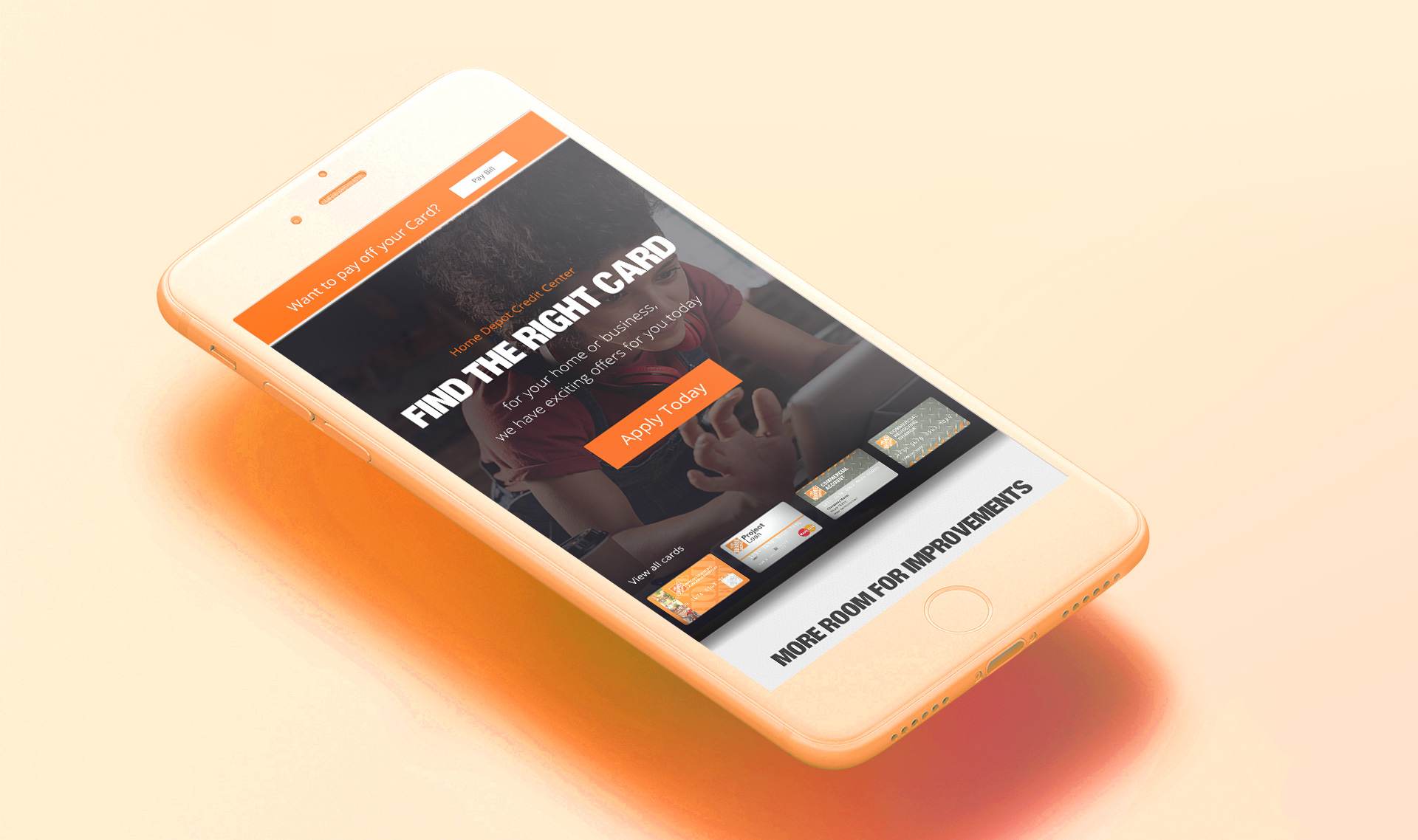
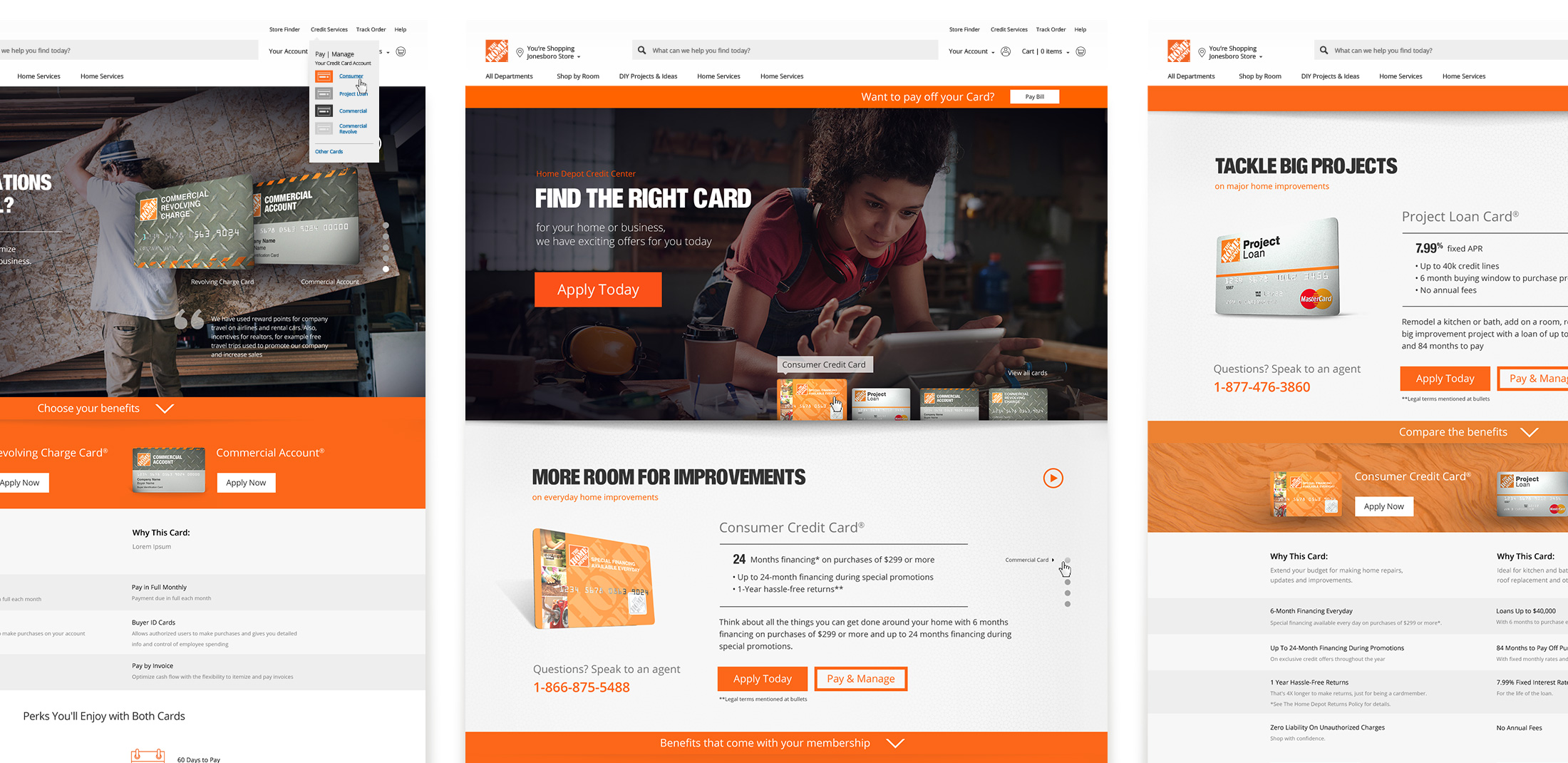
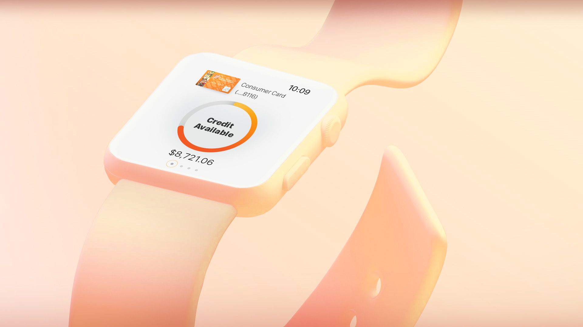
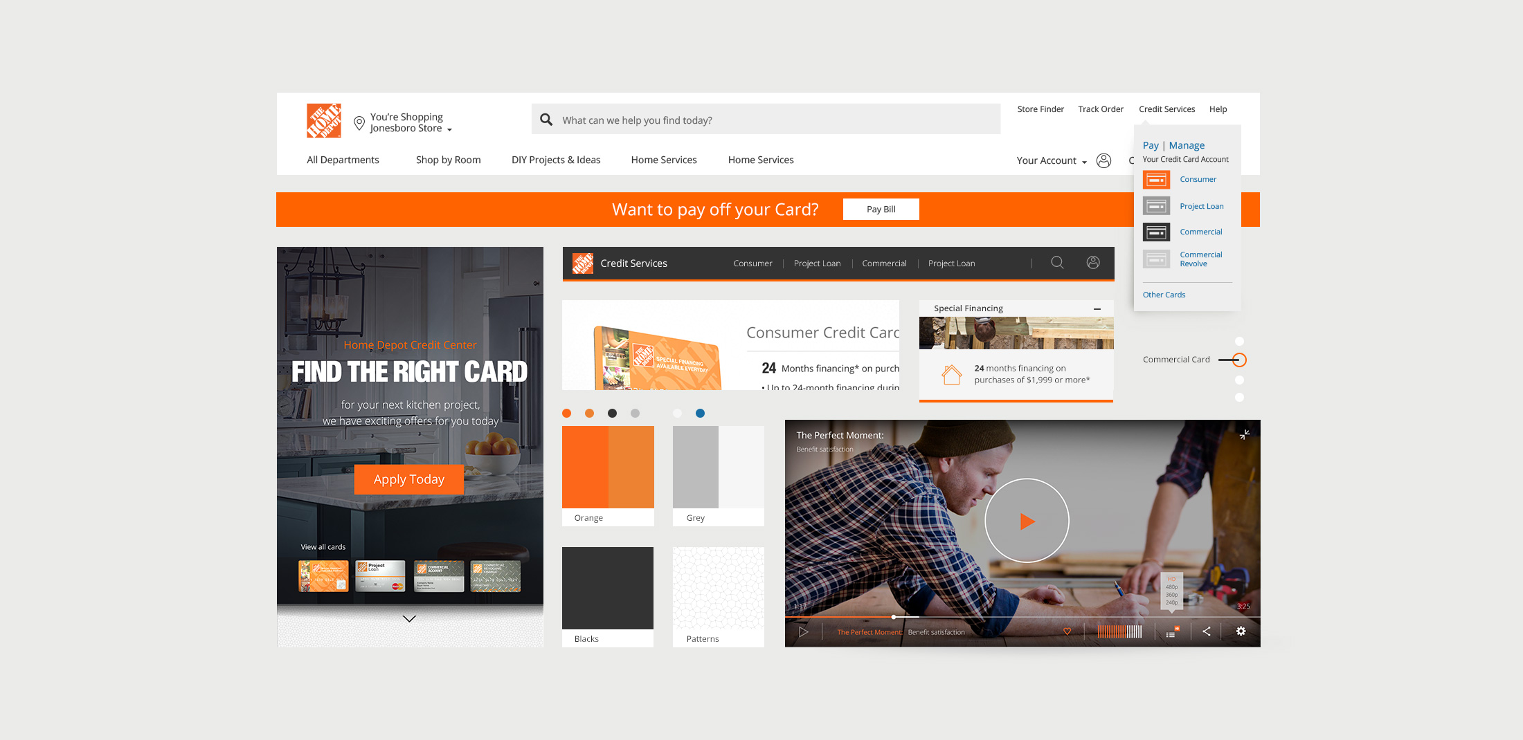
The primary focus was based on managing/paying your bill. Adding easy navigation to each of the four cards. We also developed a dynamic approach based on your journey or project based plan. So, for example if you were seeking finance for a kitchen project via google search or an HD purchase path the solutions page would dynamically visualize solutions based on your specific needs. This was all possible by fast paced prototyping via various testing methods with identified users.
We worked around multiple technically feasible CMS solutions and also will be rolling this out on various phases adding much needed user friendly tools “calculators” and micro-interactions and of course iterating as we learn more interaction behaviors with our customers.


