Scalable & Modular Design Language

USER TESTING

85%

UI/UX

90%

PROTOTYPING

80%

VISUAL/DESIGN

75%

 My primary goal at Home Depot is to led the next generation of the online brand experience. The idea was to build a scalable and modular design language that could be built upon over time. Also, understanding that the UI/UX language that was first inherited was basically set in the stone age and was light years behind current global usability standards. So, whatever route we decided to go; it had to not only be remarkable within usability design but also inherently be visually appealing to the various platforms/mediums responsive in its true nature.

So, this task was twofold via mentoring our group of talented architects/designers and also managing and educating leadership along the way using a solid foundation of analytics, technically sound and feasible design patterns, and good old sweat and tears.

Understanding the core teams

First it was a matter of all the Home Depot teams understanding the existent of their ecosystem and what role they play within the brands core values and overall voice.

Dotcom

App

Decor

Pro

CRM

Signage

Breaking down silos

Educating and helping these teams understand system design was not an easy task, but at the core of all this teams wanted to have a single source of truth for consistency at scale. The ultimate goal was to design / maintain / evolve / together as one Home Depot core group.

I’ve got data + research now what do we do with it?

Together the brand squad looked at past research defined by each group. Promotions, Sales, received expensed-cause and effect from the last three years.

We also generated new tests via User Testing within our respected channels. Solely focused on the human/customer rather than old agency methodologies to gather controlled experiments on new possible solutions all targeting our core user base.

Each dollar counts, again we didn’t get to become the leader in home improvement over night. We wanted this research to go beyond the data and have this be the seed for opportunities to manifest within the business.

DESIGNING FOR ENTERPRISE

A large unification effort

INTERPRETING MATERIAL

Macro Goals
1

Govern the spirit of the System with (simplification, interaction, motion)

2

Translate it for a world in which there’s much more information, desired density, and complex data (tables, visualizations)

3

Unify the design of all the brands enterprise products.

PREPPING FOR THE DESIGN SYSTEM

Audit existing (Atomic, Element, Modules)

Make it much easier to convert to material by setting current designs up to swap out one component for each rather than redesigning each screen.

Assess collection and use cases

Decide on one version of each existing element based on current use cases and make any necessary improvements

“Taking from our Material Design, the few redesigned atomic levels on our list. Thinking within user touch points, future renders on multiple devices, and always thinking about product clarity to reduce clutter and improve on customer satisfaction.”

Drop Down and Input Fields examples

Again, here we dived back into our atomic level, for example our Dropdown menus and our input text fields needed some guidance, a before and after - (now material-ready)
2

Before

Very rigid grid-based layout structures
3

After - (Material Ready)

Responsive Design applying animations and transitions, padding, and depth effects such as lighting and shadows

Create documentation for our multiple squads – engineers to inform them while exploration, testing, build, adoption. Our 10 commandments for pattern change.

Prioritize and Explore

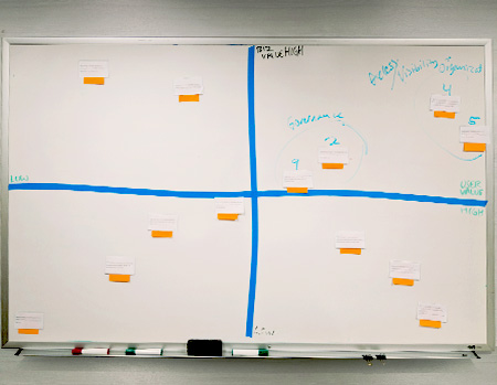
Meet with engineers and Product managers along with the stakeholders and establish each element’s implementation “priority” and effort” levels, as well as answer and questions about the new UI specs. Further understanding each sides perspective view point.

EXPLORING WITH MATERIAL

I saw this as an opportunity to explore – champion the much-needed functionality and process of educating out to squads at a larger scope further increasing the overall value of our Design System. So, creating a clear process for communities to duplicate and leverage was key. Roadmap creation, prioritizing scopes, user feedback, leadership buy ins, execution, development, adoption, new possibilities teaching Material Design.

CONTINUOUS EDUCATION WITHIN HD DESIGN SYSTEM

Final Thoughts

Communicate what’s needed to build your ideas.

Discussing priorities and effort levels with engineering teams helped prioritize design efforts and built more trust and respect between the design and engineering teams.

Leave a Reply