The next generation of home improvement

USER TESTING

85%

UX/UI

75%

PROTOTYPING

80%

ARCHITECTURE

65%

The Home Depot revolutionized the home improvement industry when its doors first opened. People came to this new place to save money, learn how to do things themselves, and take on projects they never would have taken on before. They would wander the aisle with excitement for all the possibilities they held. But over the year Home Depot has evolved, but it’s customer perceptions haven’t.

In this project, the key strategy was to showcase how we not only invented the home improvement category but how, we’re also the ones bringing them the next generation of home improvement. This is how we delivered the first phase of Smart Home and how we delivered product innovations, technologies, services, and tools we have that give them smarter ways to get things done – ways they’ve never had before – and solve real problems within a category that is ever evolving.

Smart Home Journey Mapping

journey flow sh

Research

Following the IDEO model for the human-centered design, we started the process with usability testing and ended with validation. This process provided the team with a roadmap and a solid foundation to base possible design solutions on users findings.

Validating Content

For the next phase, we went out to the streets and conducted multiple guerilla usability tests using our customer journey mapping. We tested on customers using secret shopper tactics as well as targeted associates with usability testing. We were than able to meet users that validated some of our persona hypotheses and than could spot some pain points that emerged through using both experiences.

Proposed Build

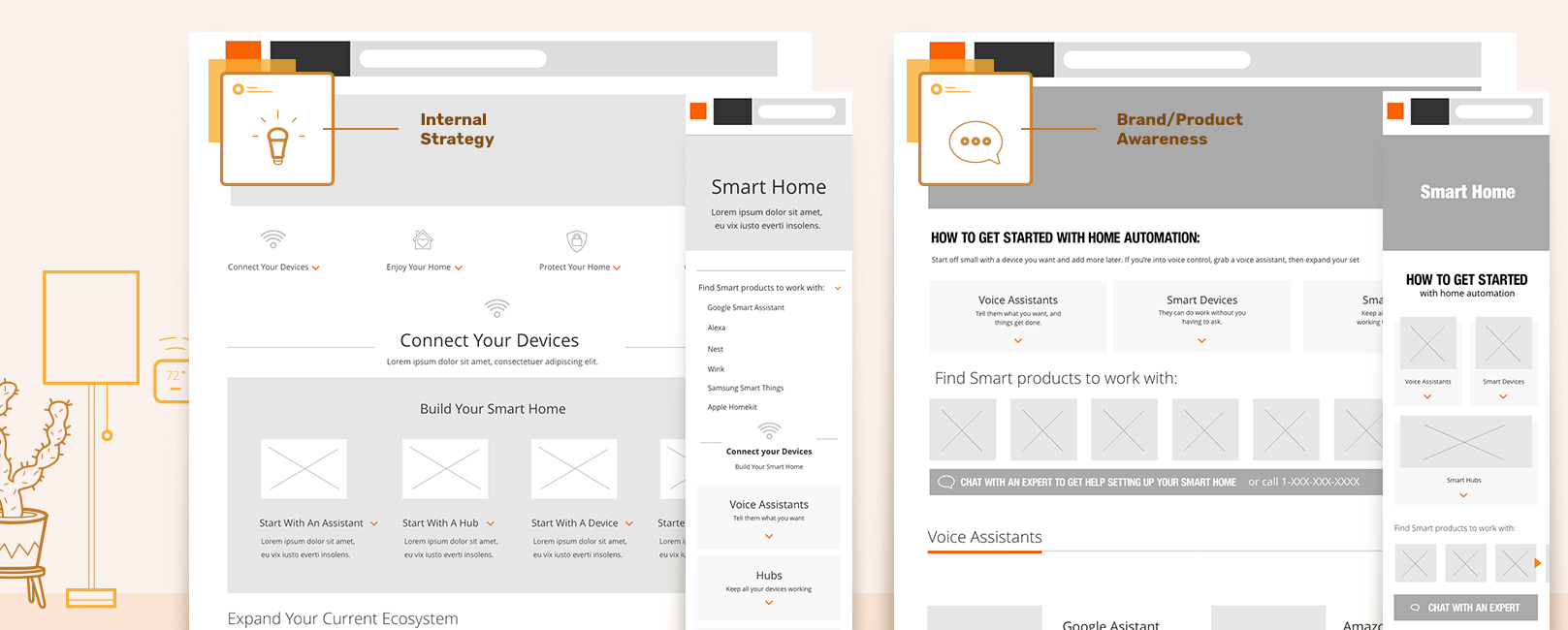
After our low fidelity tests we turned our ideas into a clickable prototypes to validate solutions using Adobe XD, which in return will allow us to make the right experience for our end users.


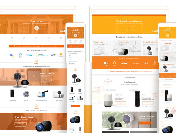
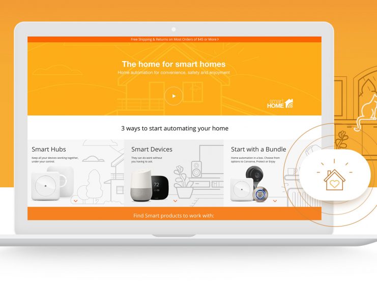
A/B Testing

Designing attractive landing pages and increasing conversion rates
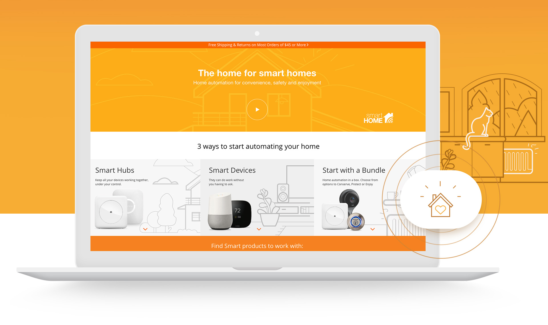
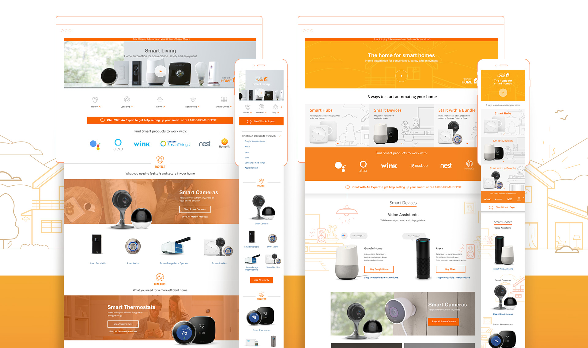
are not the same things. In these two solutions we tried to divide internal
strategy versus user-centered-playful design alternatives, that lead users
to shop product, returning better conversion.

Thank You!

Leave a Reply